Well
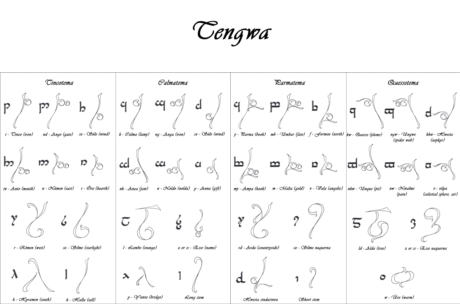
After making that poll, there has been a little intrest in, to put out my tengwa characters
Well, here they are !
In every pic, you can see the original in the left place and next to it, the new one, created by me
Ah, by the way: The tengwas are originally made in these rows:
Tincotema, Calmatema, Parmatema, Quessetema
These are not my stupid idea or something
I hope you like it
Ah, before I forget to mantion... there are monophthong in this, but the original request wasn't contained it.
If you wish, of course, I can make thoese too. It won't take too long
Are these hand-drawn or computer-drawn? If they're hand-drawn, the thing to do is probably to run them through a tracing program (potrace is good) to convert them to vector graphics, then use fontforge to put them together into a font. If they're computer-drawn, you might be able to get your drawing program to save them in vector format (eps is good), skipping the tracing step.
If what you have is bitmap scans, I can probably font-ify it for you, but I'd want higher quality scans (I tried tracing your ore and it came out pretty much illegible). The other option I'd consider is MetaFont, which would probably actually result in a better font and I might do it eventually anyway, but would take me a lot more time (and work).
There are also a lot of decisions to be made--like, do you want tinco and sule to be the same height and depth (as you've drawn it) or do you want all the bows to be at the same height (as Tolkien did it)? I should warn you, if you don't make the bows the same height, you're probably going to have problems with the tehtar.
Actually I still miss the wovels from this font And yeah, these are hand drawn on paper, scanned in after, modified a bit it PS. Back then I didnt have a tablet. I think it would be a lot more easier if I just trace the scanned images with my tablet in PS, since I have absolutely NO clue how to use the vector mask properly That being said, if you look around in my scrapbook, you can see a few tries that how it would look if I'd write it with Tolkien rules Minus the vowels tho Just copied the pics one after the other
It would be nice if I could make it a font, however, I have no clue how to make one
I assume I'm the hundredth person to mention that the original Parma is backwards here - a duplicate of the Calma - but that's just me being picky. This is lovely.
*shrugs* I got a typo template from the HTA (Hungarian Tolkien Association) and I worked using that Well if it is not totally correct, than it seems I still have some stuff to correct
Anyways, glad you like it ^^ I like how some of them turned out :3
Glad you like it :3
I'm kicking a useable font together with the help of another deviant artist on DA
Hopefully it will be up soon ^^
Glad you like it
I actually just used the typed format I was given
If what you have is bitmap scans, I can probably font-ify it for you, but I'd want higher quality scans (I tried tracing your ore and it came out pretty much illegible). The other option I'd consider is MetaFont, which would probably actually result in a better font and I might do it eventually anyway, but would take me a lot more time (and work).
There are also a lot of decisions to be made--like, do you want tinco and sule to be the same height and depth (as you've drawn it) or do you want all the bows to be at the same height (as Tolkien did it)? I should warn you, if you don't make the bows the same height, you're probably going to have problems with the tehtar.
And yeah, these are hand drawn on paper, scanned in after, modified a bit it PS. Back then I didnt have a tablet.
I think it would be a lot more easier if I just trace the scanned images with my tablet in PS, since I have absolutely NO clue how to use the vector mask properly
That being said, if you look around in my scrapbook, you can see a few tries that how it would look if I'd write it with Tolkien rules
It would be nice if I could make it a font, however, I have no clue how to make one
I assume I'm the hundredth person to mention that the original Parma is backwards here - a duplicate of the Calma - but that's just me being picky. This is lovely.
I got a typo template from the HTA (Hungarian Tolkien Association) and I worked using that
Anyways, glad you like it ^^
I like how some of them turned out :3